 Wendy Weng®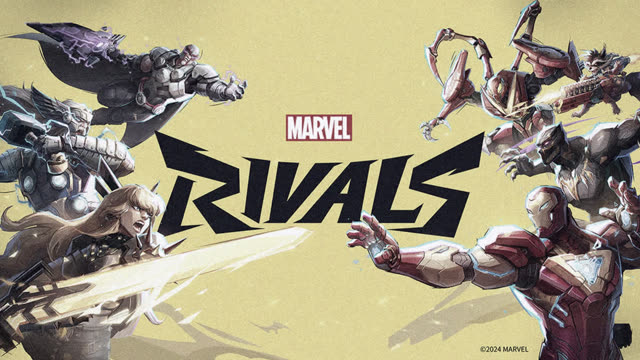






Marvel Rivals
NetEase × Marvel · Long-term collaboration · 2023–Now
Role & Scope
Overview
Unified,
not rebuilt.
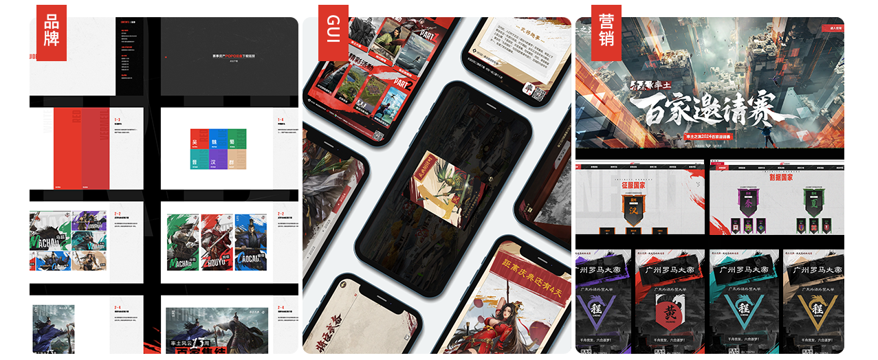
When we joined Marvel Rivals, launch was already closing in, and the materials in and outside the game had no design system yet. Rather than redo everything, we reorganized the existing designs under one visual language and built a brand asset library that runs through in-game identity, esports, marketing and merchandise.
What I led
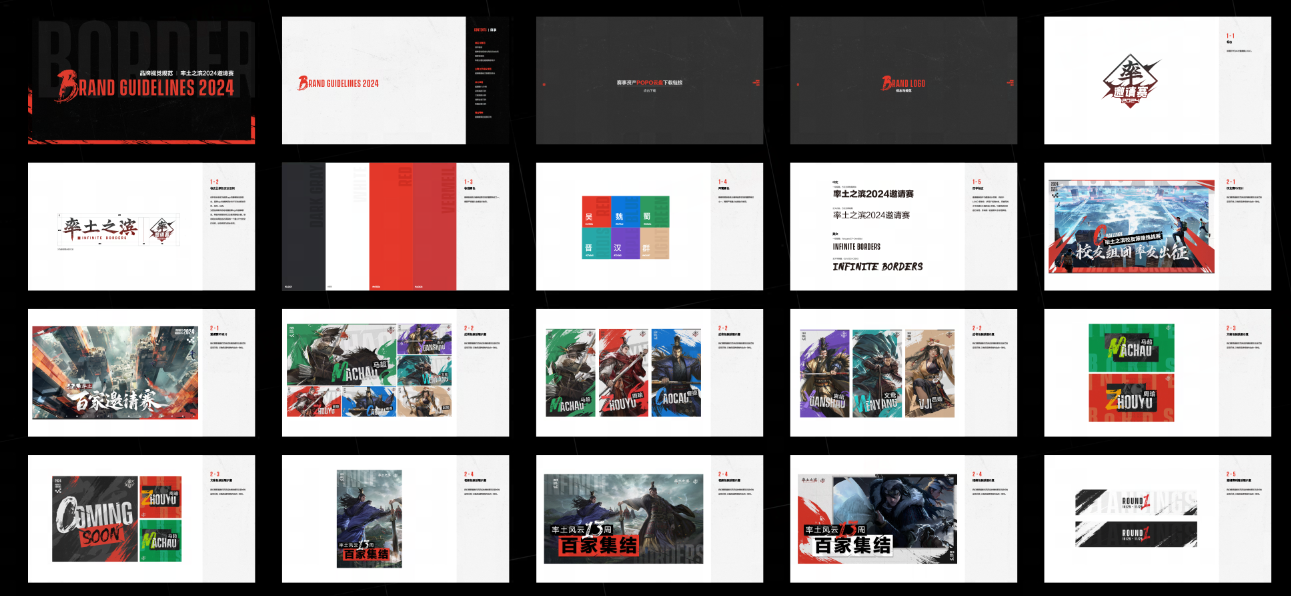
Led the brand-design positioning and authored the brand book.
Integrated the in-game GUI.
Built the in-game motion design language through the Super Symbol.
Unified motion brand packaging and built a motion-identity system to raise production efficiency.
From community to merch, one design language carrying one consistent attitude across every surface.
Challenge
How do you make Marvel Rivals stand out among all the Marvel IP products?
Marvel Rivals is the 3A shooter NetEase built with Marvel over years of collaboration. Against the sense that “Marvel games all look alike,” we built an identity that is instantly Marvel, and just as instantly Marvel Rivals.
Our goal was to build Marvel Rivals into a global brand. In-game GUI, marketing, esports, merch and publishing all appear on their own, and getting them to speak with one voice was our biggest challenge.
The Data
The audience research, the brand-DNA touchpoint map and the PV-pipeline efficiency numbers sit on a separate protected page.
One symbol,
built from energy.
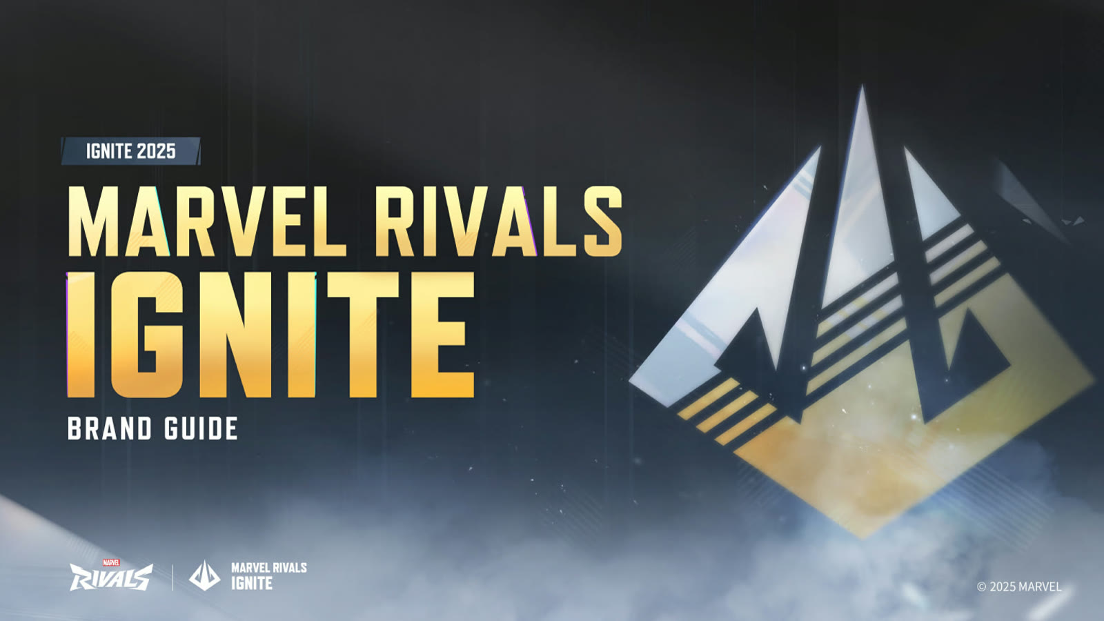
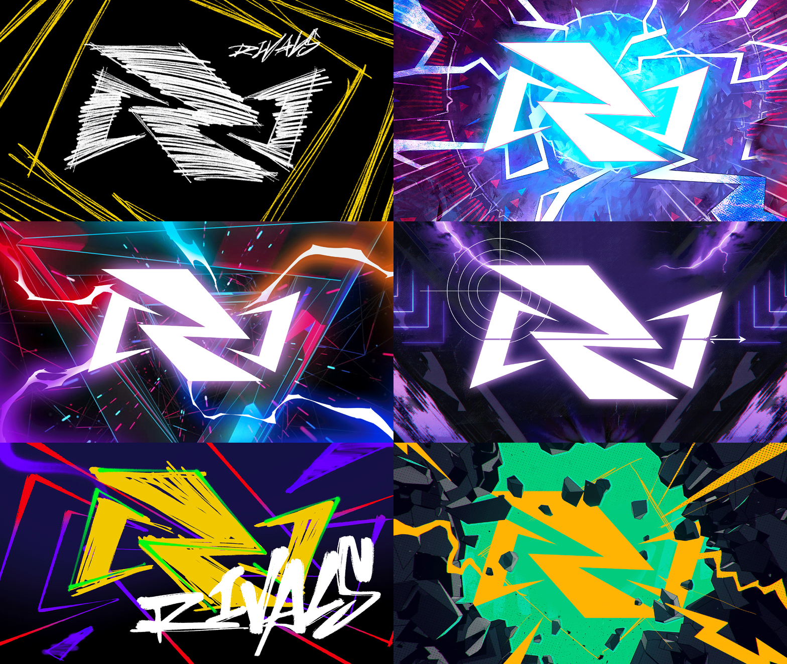
Beyond the logo, the brand needed something stronger and far more versatile, working everywhere from a small HUD mark to a full tiled background, across every design. So we made the Super Symbol, drawn from energy and crystal. Players read the symbol first, then the name.
Keywords Plan

A visual at once Marvel,
and unmistakably Marvel Rivals.
Super Symbol Concept
R + I → energy → [ ]
Deconstructed straight from the logo.
The Mark, Energy Tears the Bracket Open
 ▶
▶
 ▶
▶
 ▶
▶
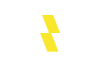
The strokes of R and I combine into an energy graphic. Along its path, spacetime tears open, and the opposing bracket [ ] appears. Confrontation, energy, time-entanglement: the game's worldview in one shape. Curves soften the rigidity; the outward-expanding forms keep the sense of confrontation.
The Wordmark, RIVALS


Stroke-trail details radiate from the centre, speed and expansion, pulling the eye to the focal point.
Super Symbol, Defined


The logo solves the name.
The Super Symbol solves the layout. One reads, the other builds.
Brand Colour System
Energy yellow leads.
Energy Yellow
Each hero reveal carries 50–90% of that character's own palette against 10–50% brand yellow, so Cloak & Dagger's black-and-white split still reads as the same brand. PVs push the palette into a more cinematic range.
Brand & hero colour usage



Motion design
Silhouettes, icons,
signatures.
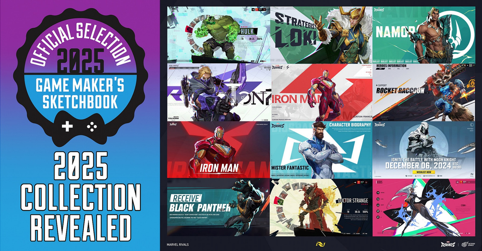
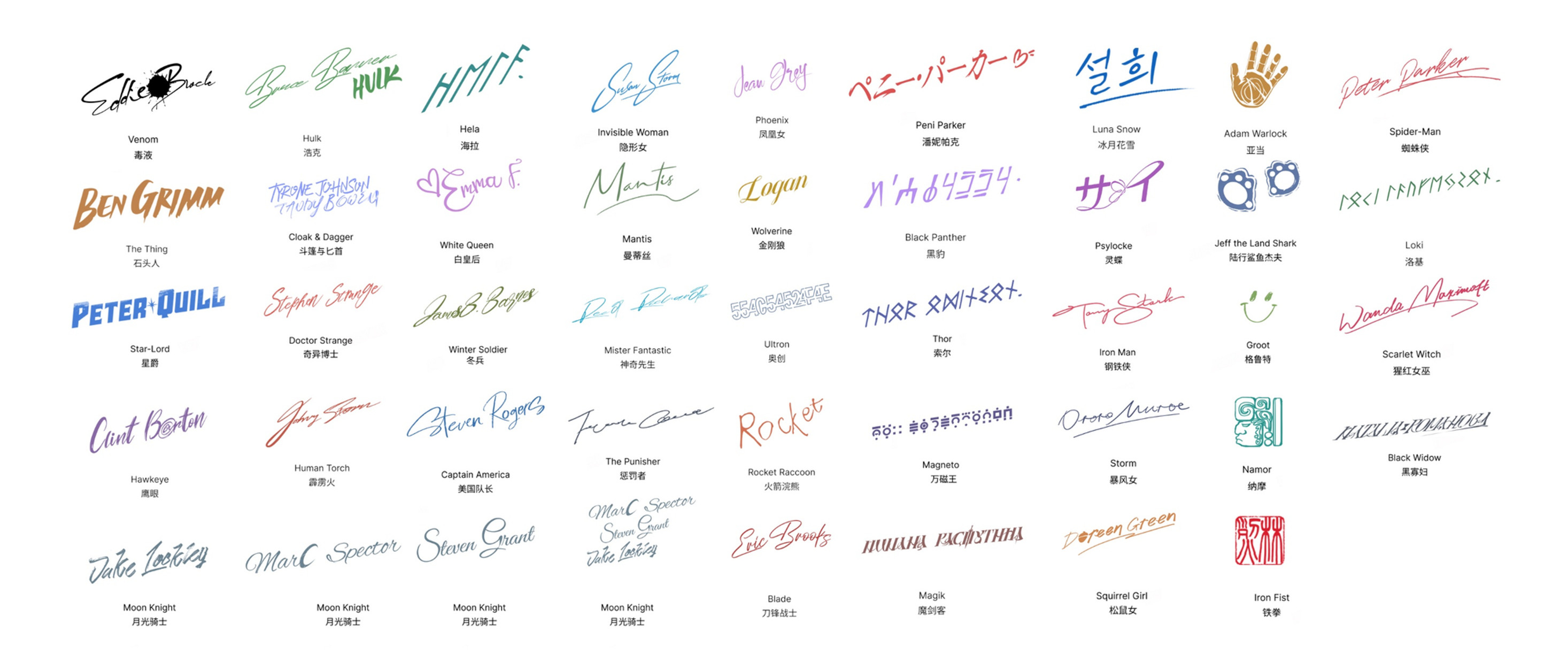
Every hero reveal hides personal marks for fans to find: each character gets a silhouette, an icon and a hand-drawn signature, built into the PV packaging. The community noticed.
Hand-Drawn Signatures
“A silhouette, an icon, a signature for every hero. The team really cared.”
Player comment · Bilibili
Design, Across Every Surface
The system, applied.
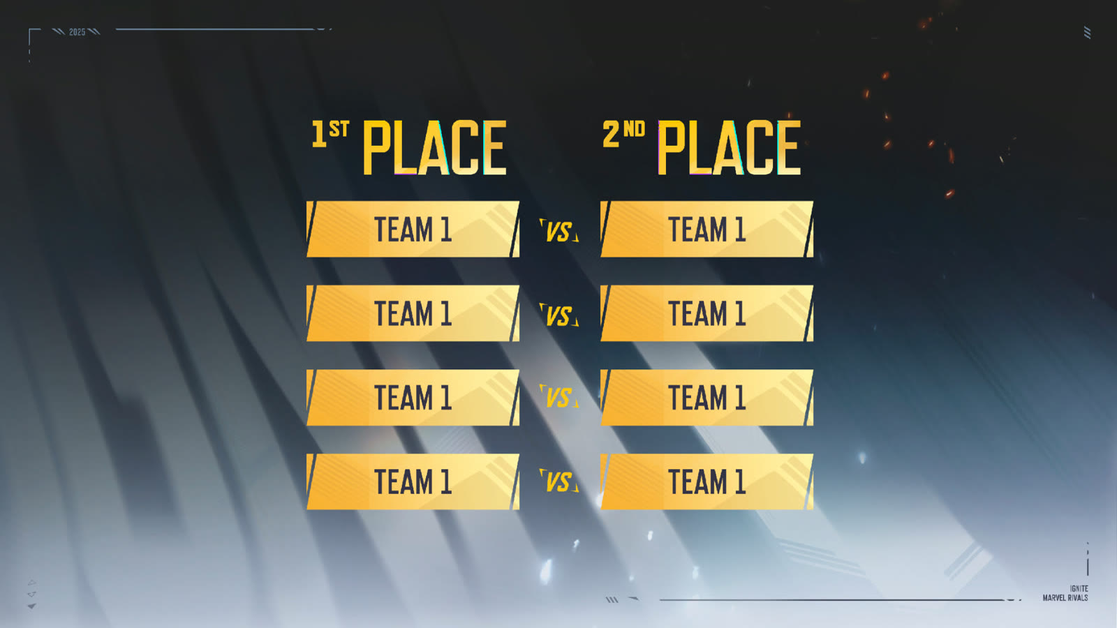
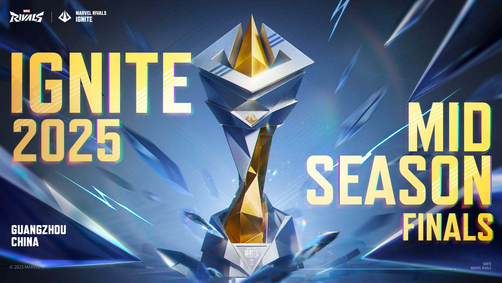
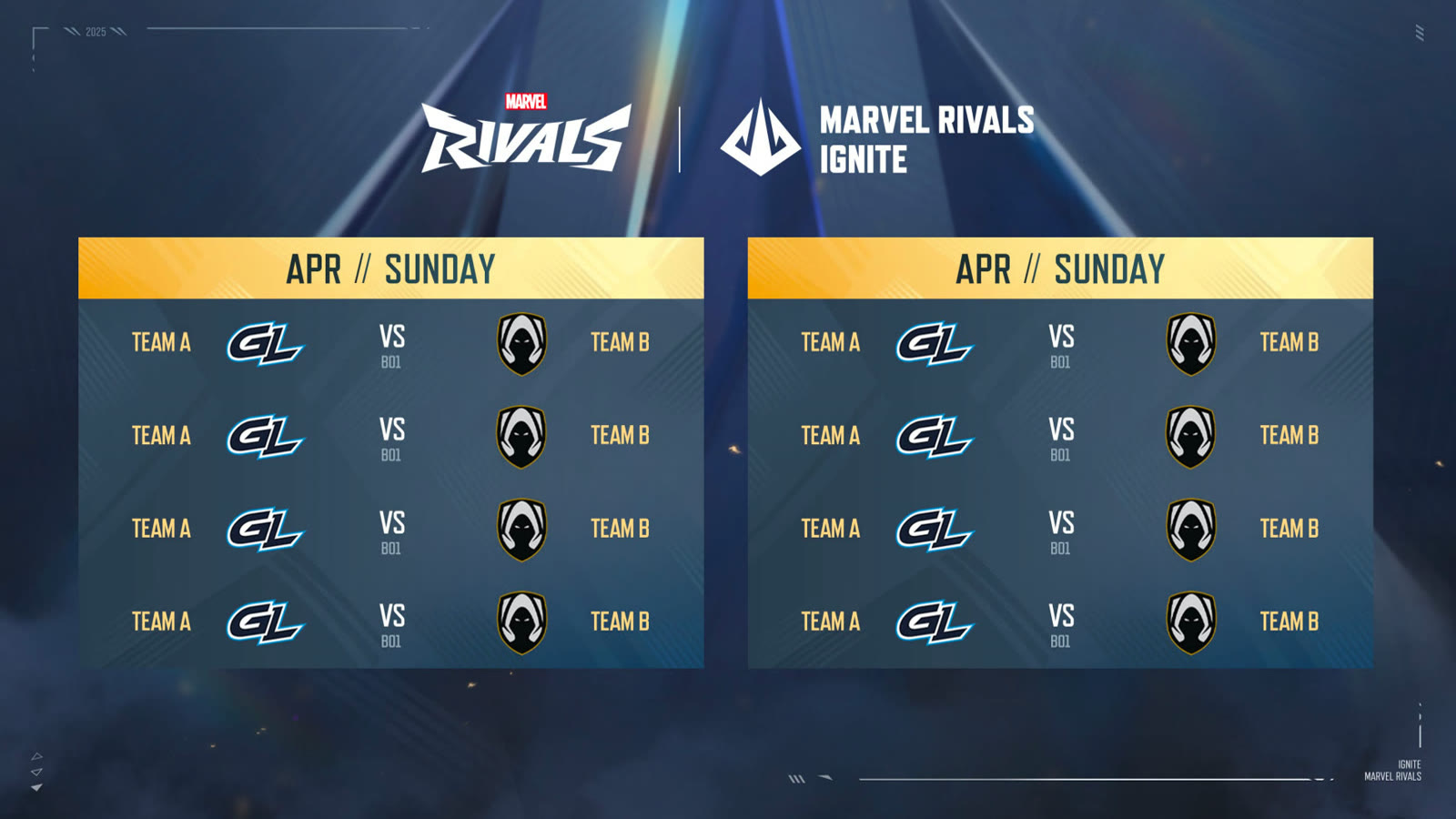
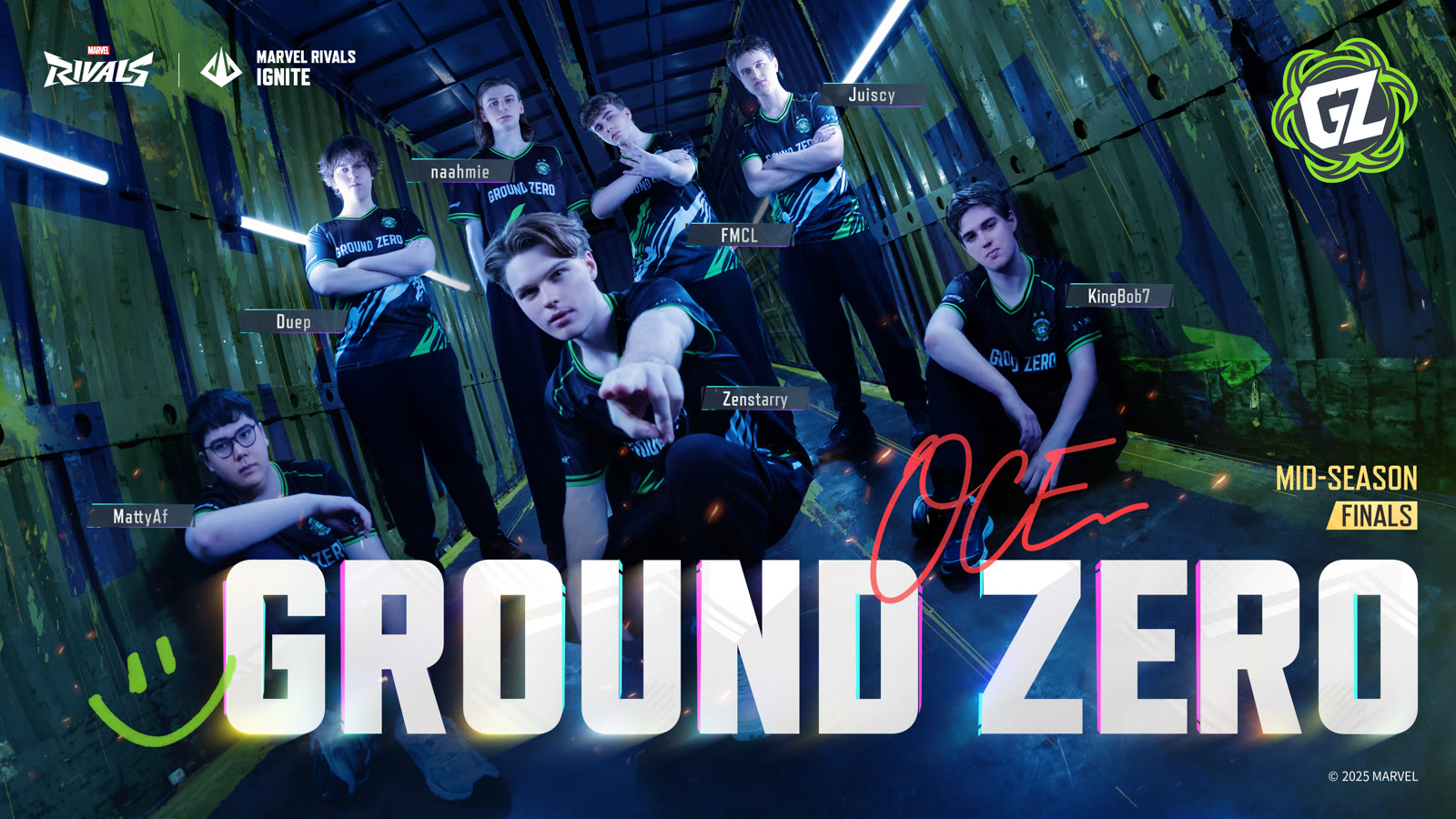
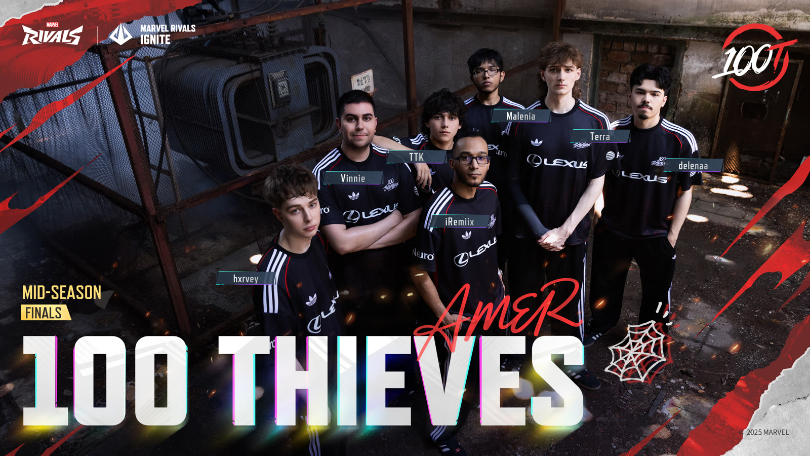
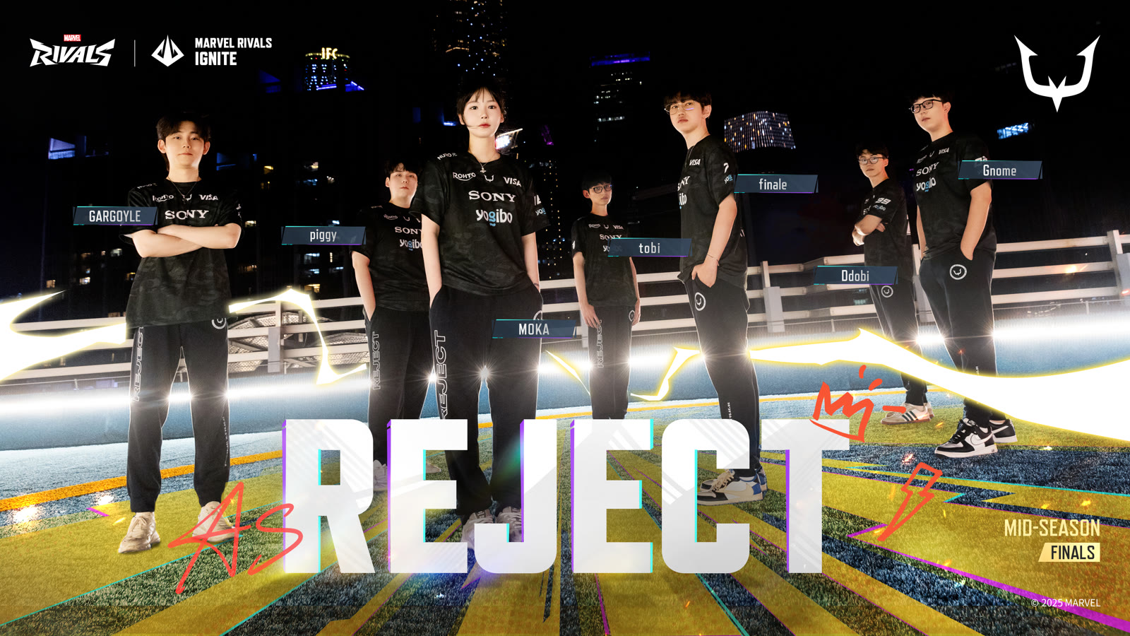
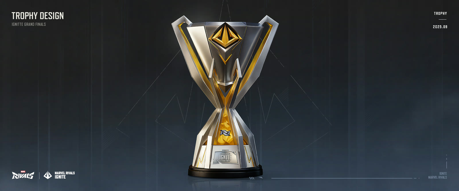
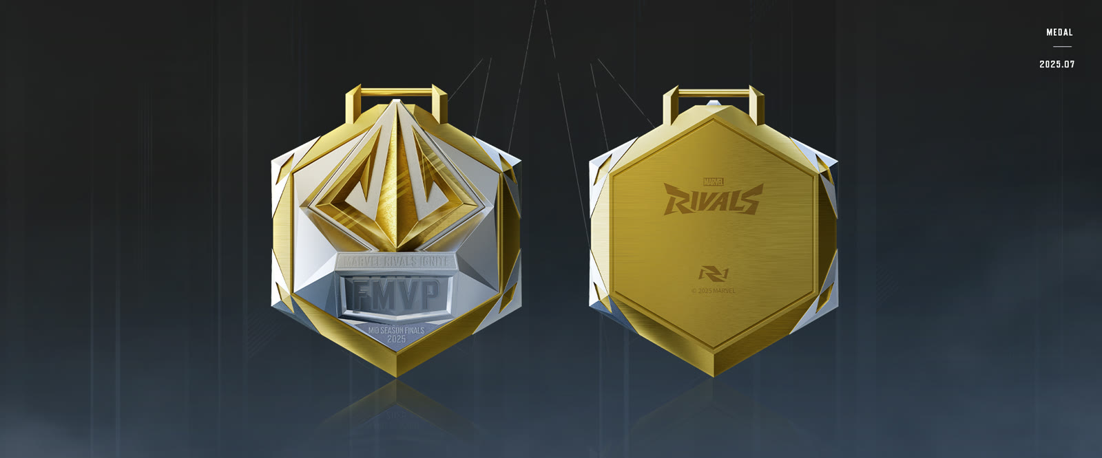
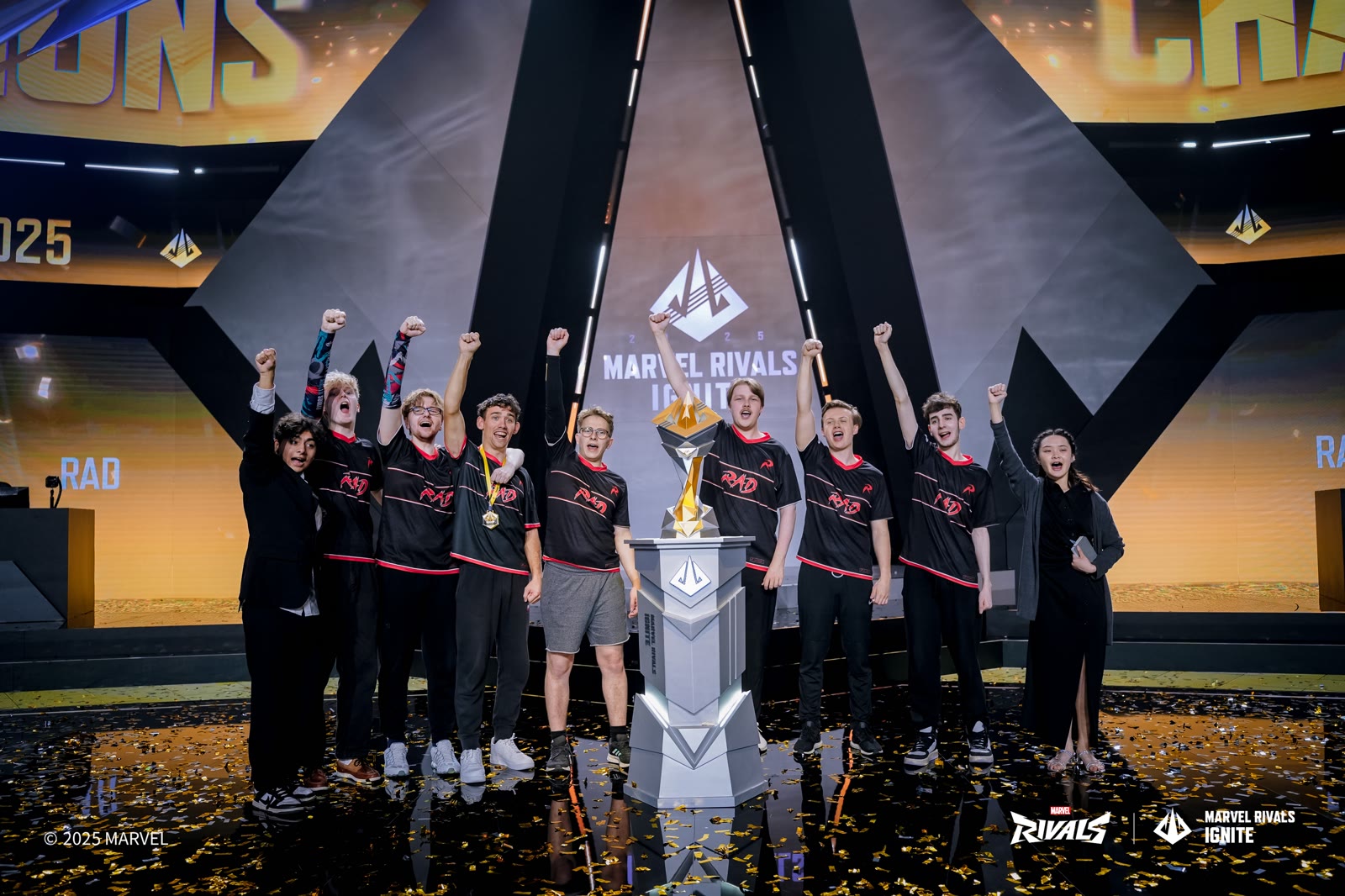
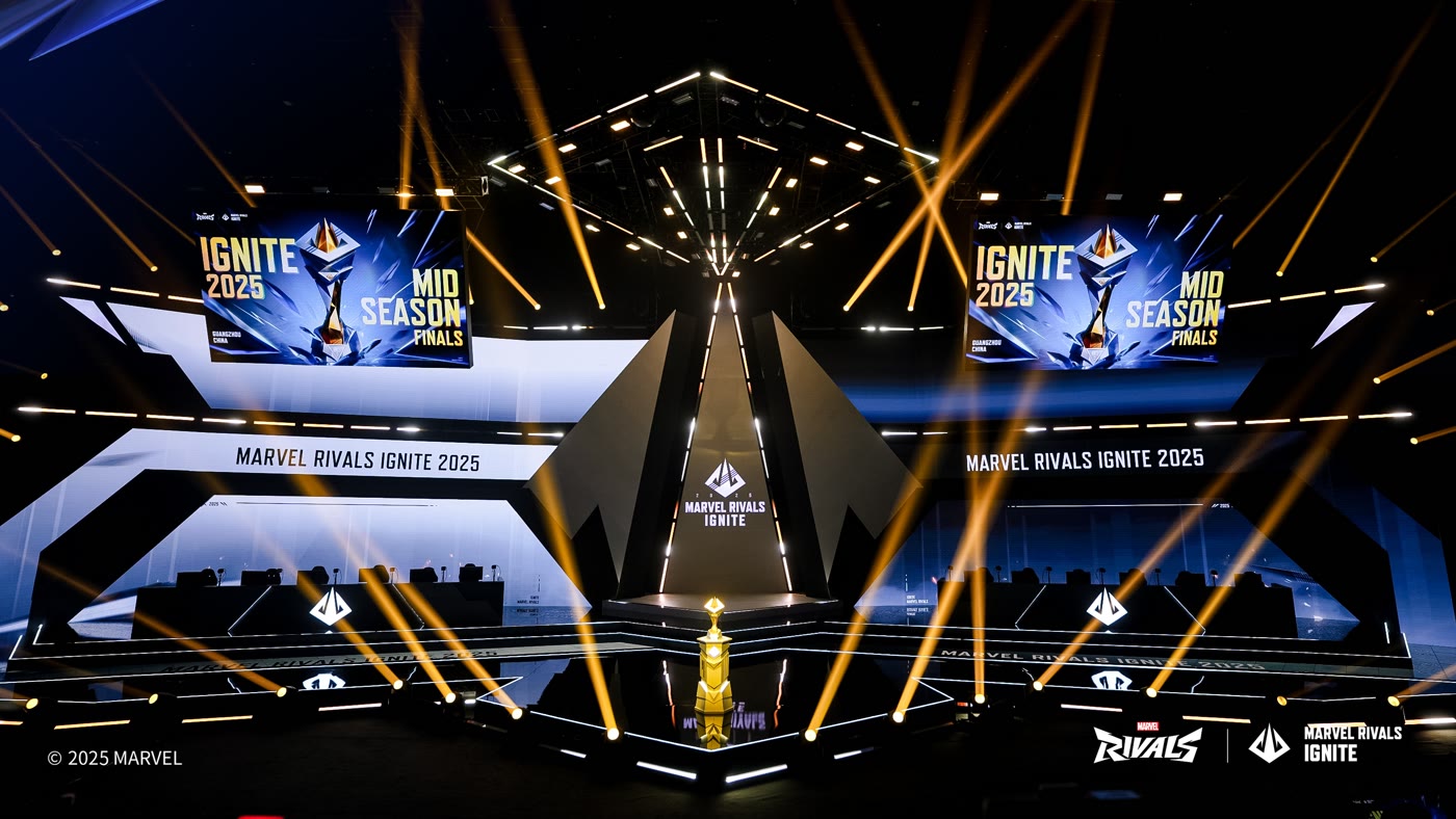
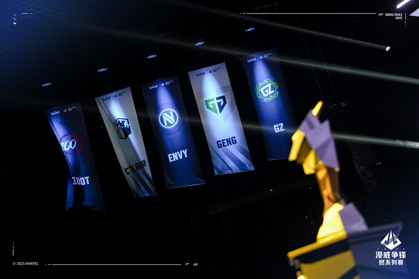
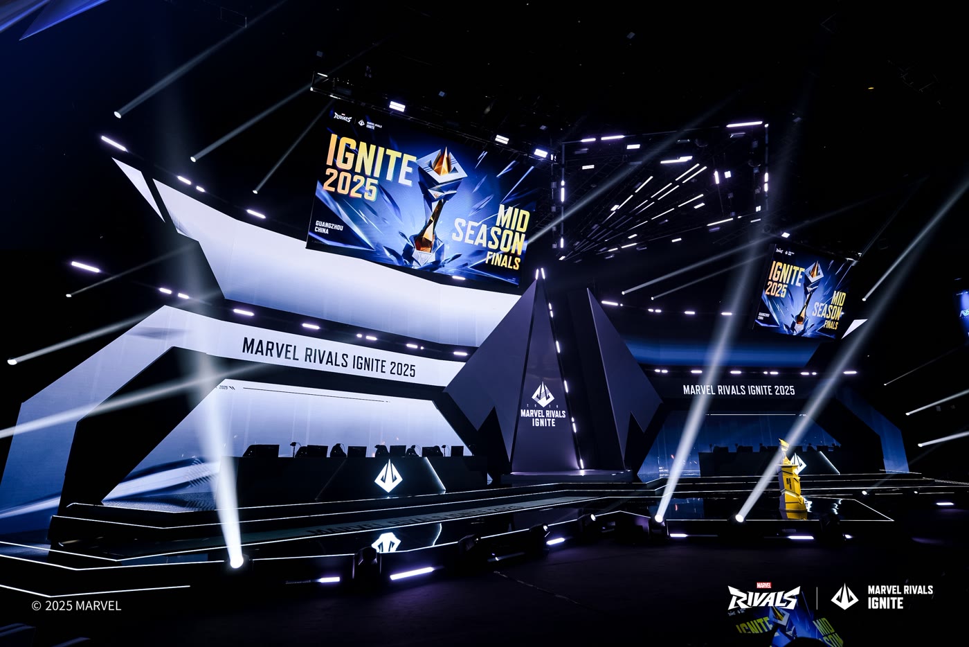
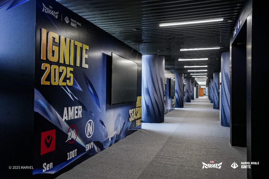
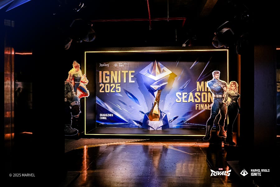
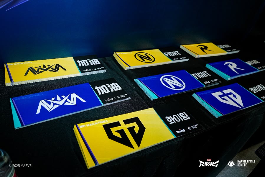
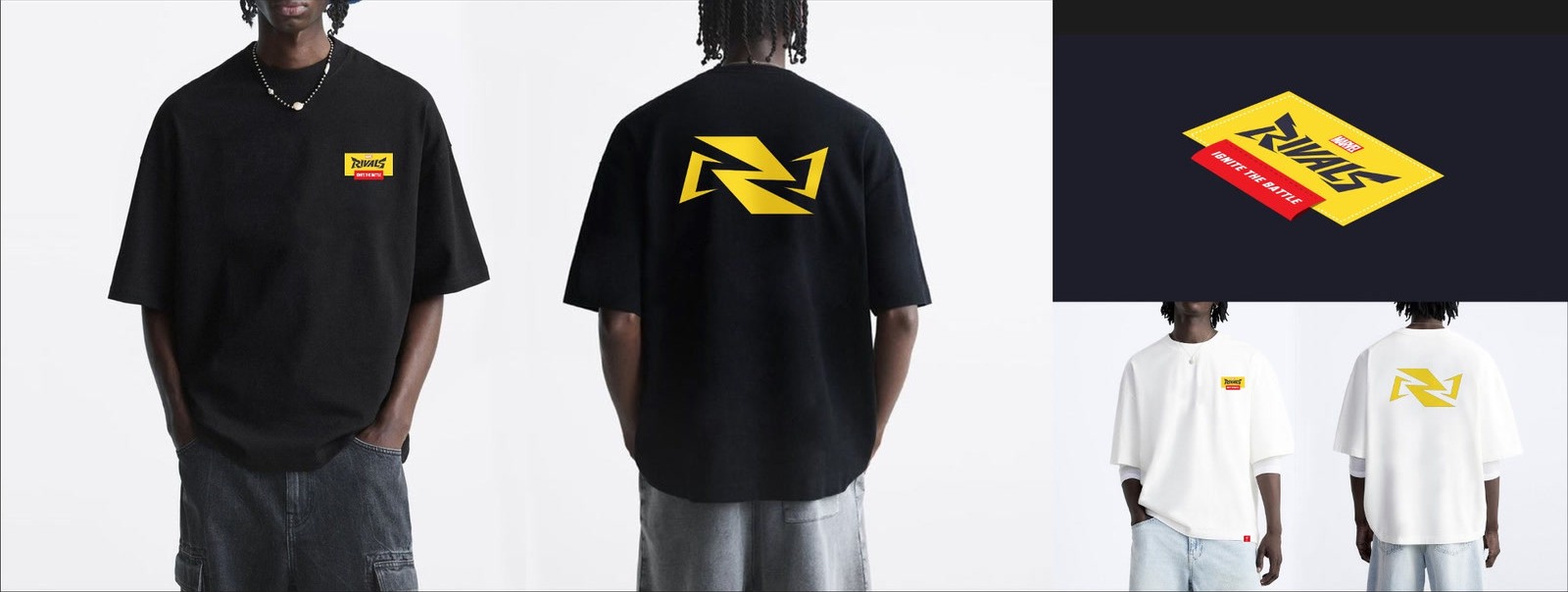
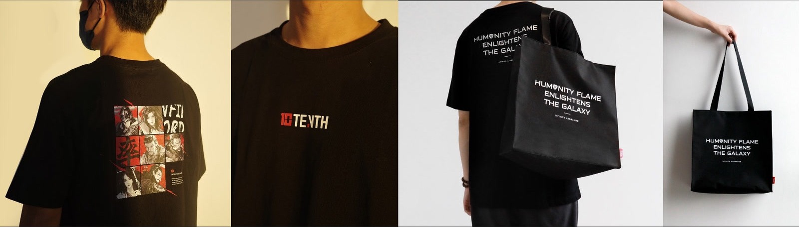
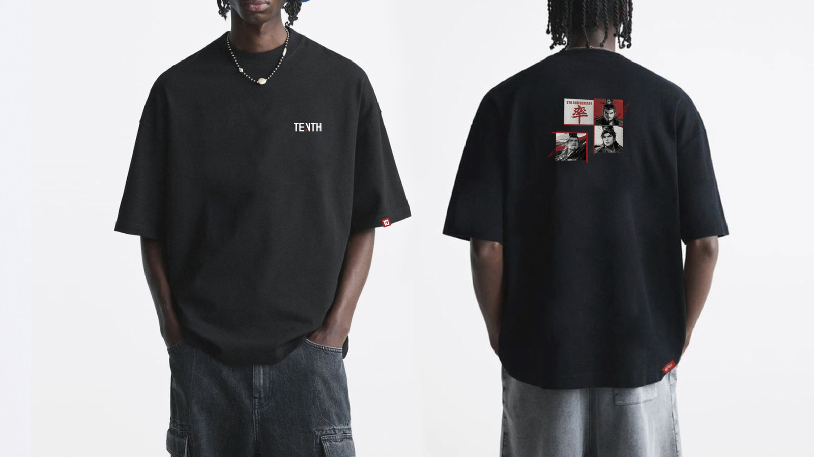
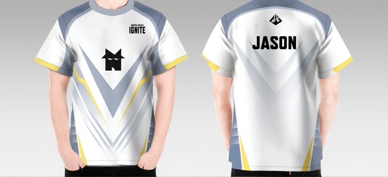
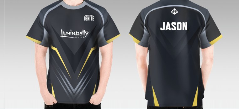
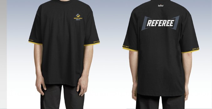
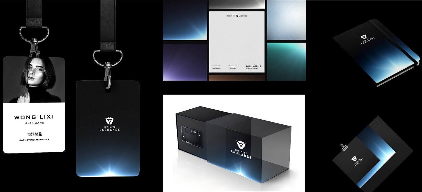
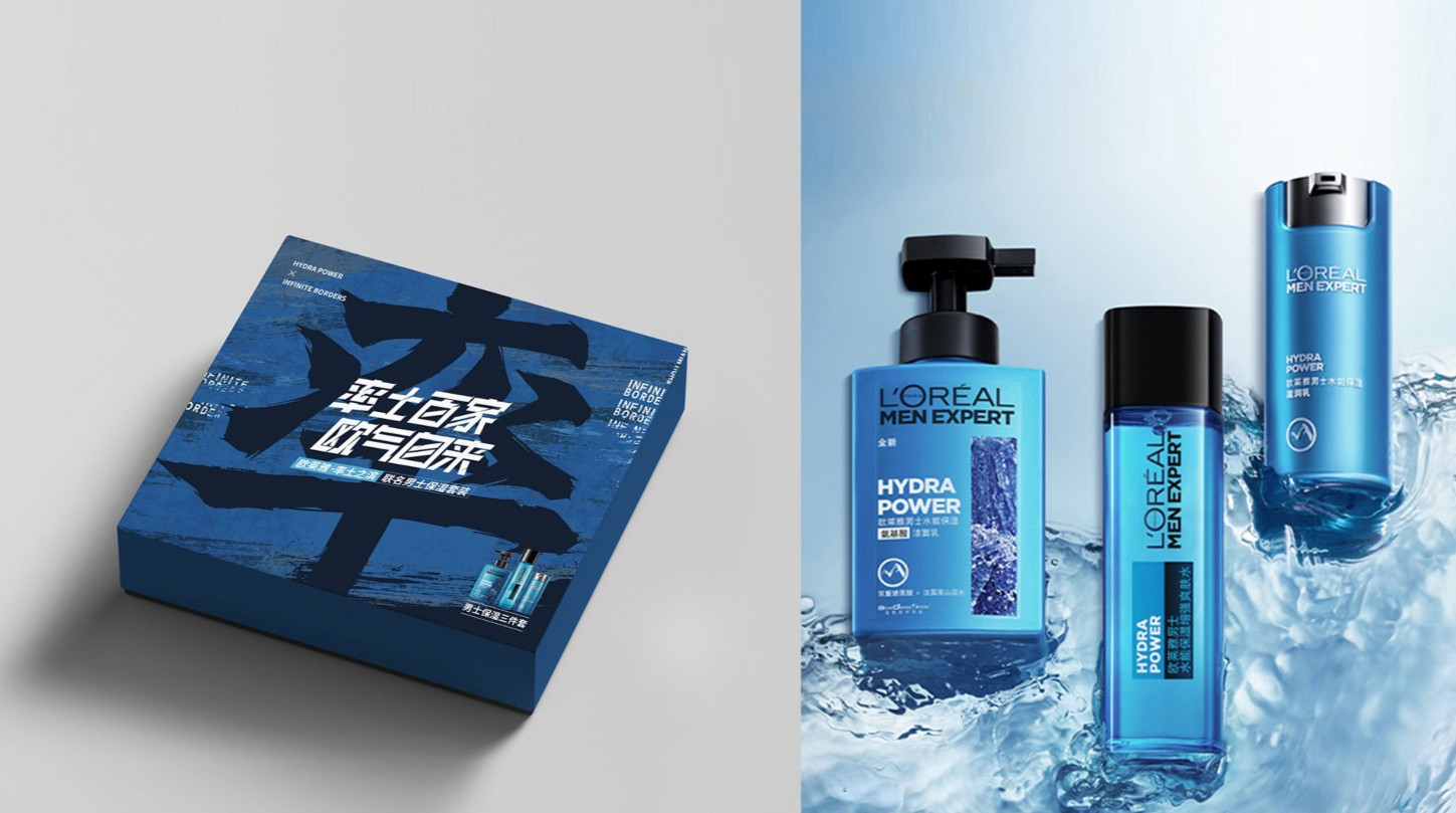
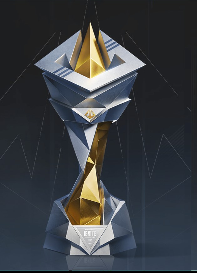
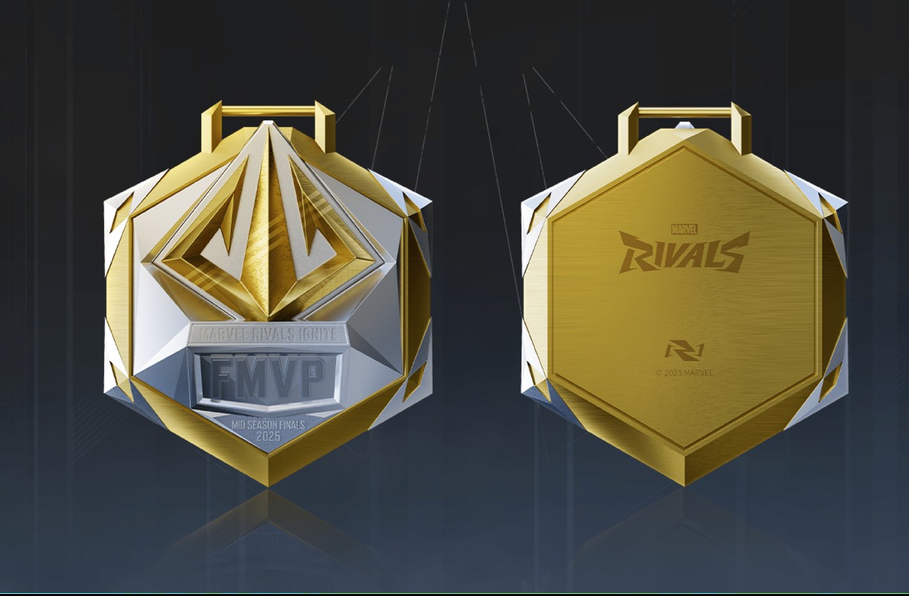
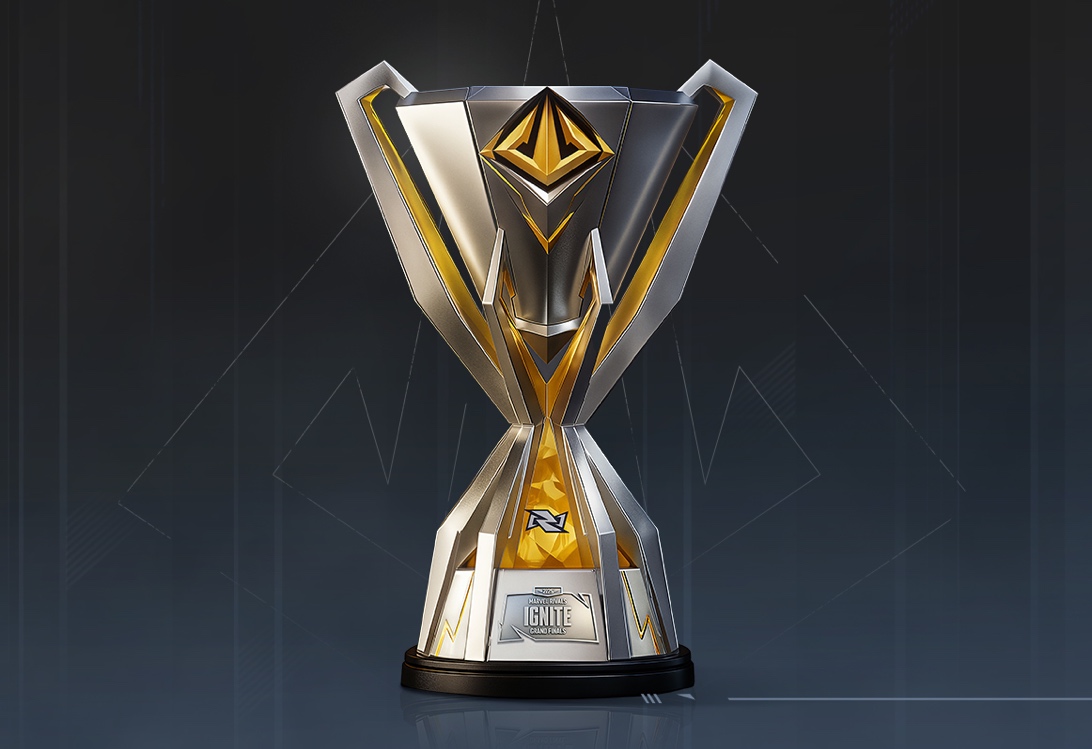
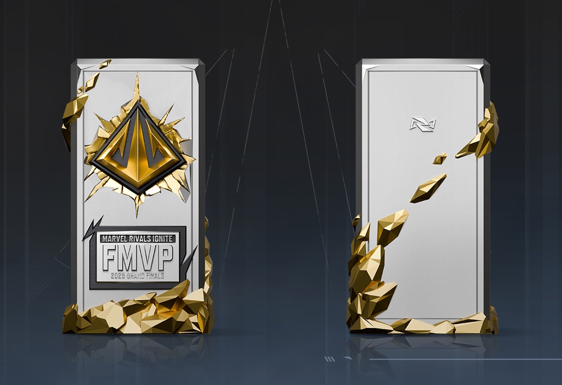
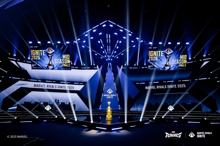
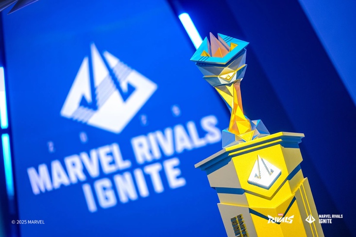
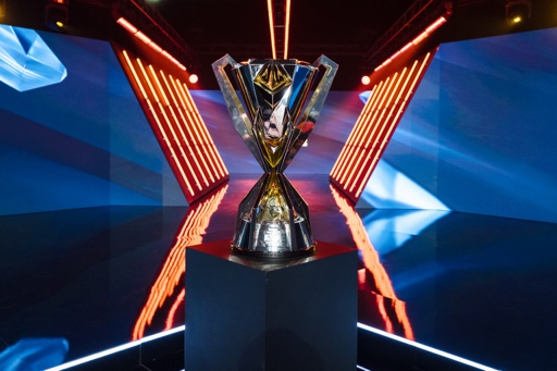
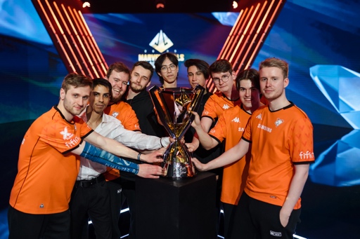
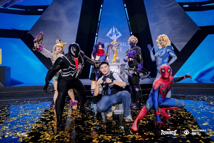
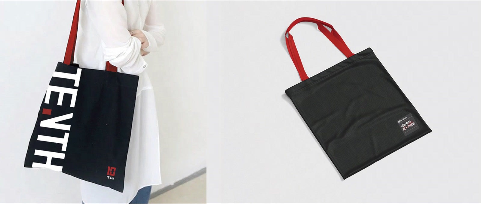
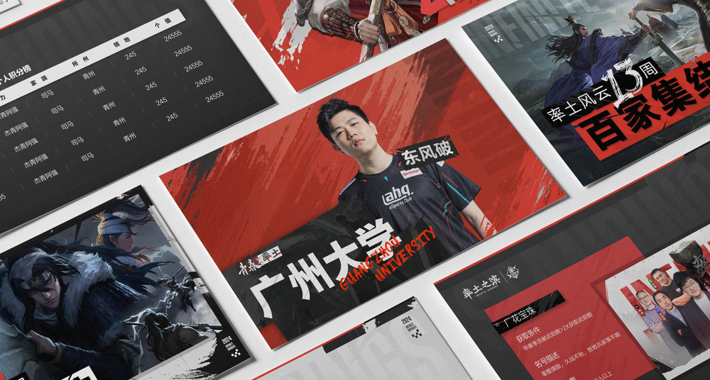
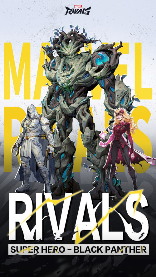
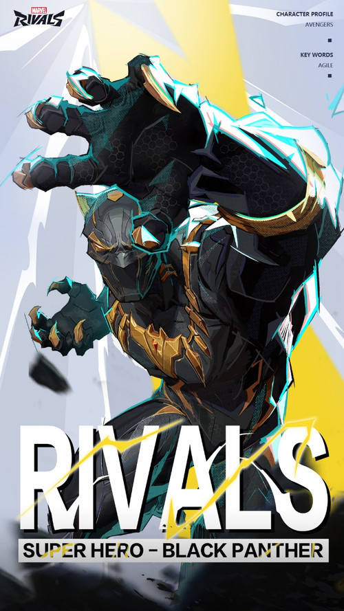
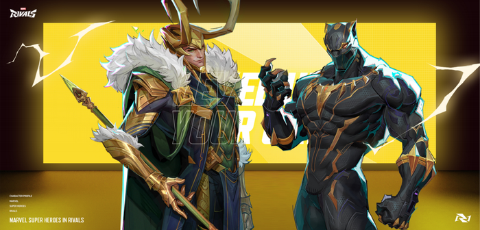
Hero reveals, seasonal campaigns, esports broadcast, out-of-home, merch and daily social, all running off one system.





In-game Environmental Graphics
Graphic design built right into the game world. Propaganda posters, signage, whole streets of New York.


Result
200M+ views.
YouTube · X · IG · TikTok
single video · X
single video · YouTube
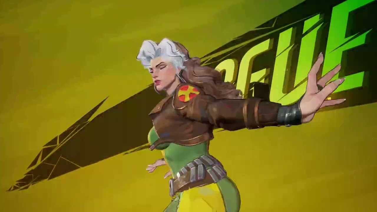


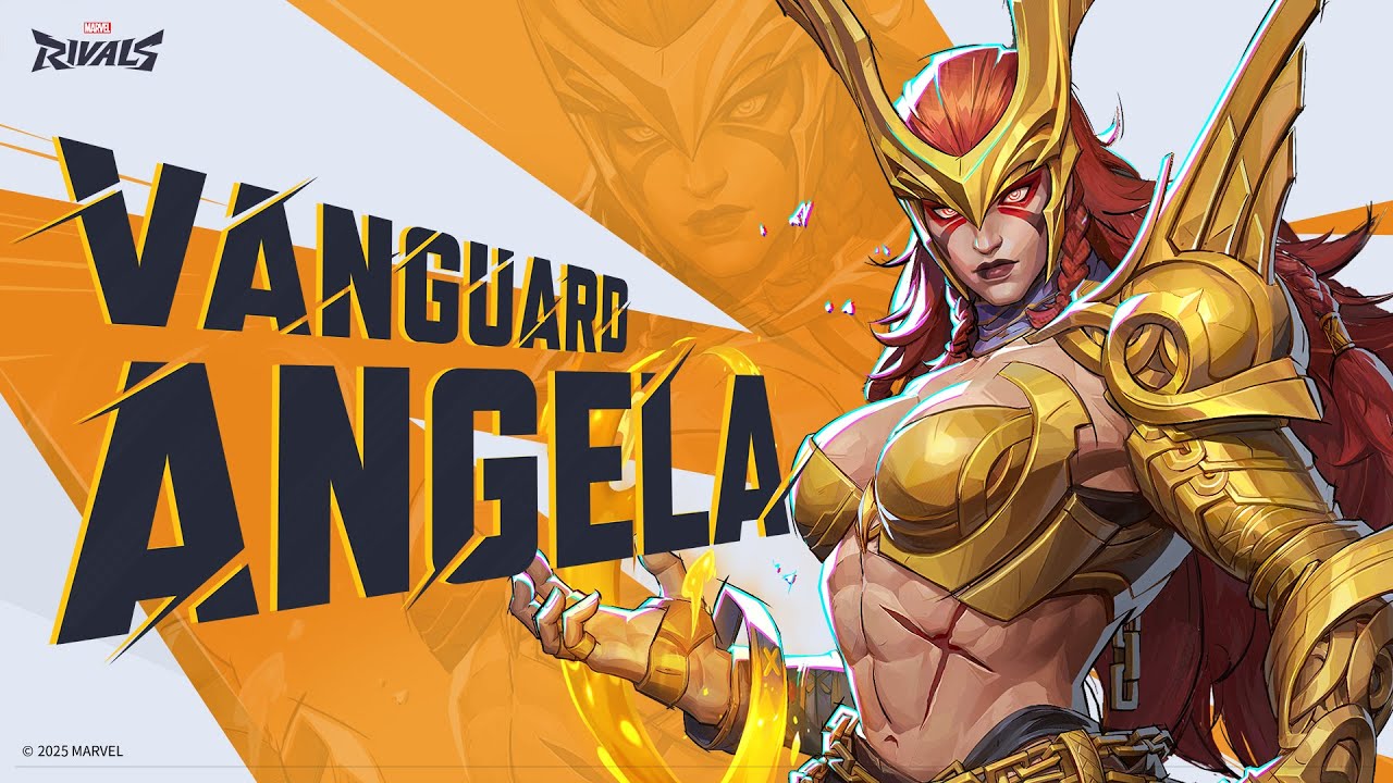
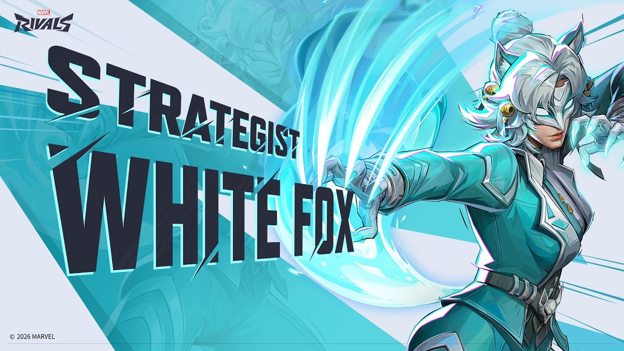

Hero-reveal PVs carried every season's beat, the Mister Fantastic reveal hit #1 on YouTube gaming Trending within 24 hours.